Strategy-led.
Research-grounded.
Delivery-focused.

I'm a Senior Experience Designer at IBM iX Dubai, helping organisations turn complex business challenges into products and services people actually use. Over the past several years I've worked across government, aviation, real estate, retail, finance and AI, partnering with multidisciplinary teams to shape products from early strategy through to delivery.

My work sits at the intersection of business, technology and human behaviour. Depending on the project, that might mean running discovery research, defining product strategy, designing complex enterprise platforms, creating design systems, or facilitating workshops that align executives around a shared direction. More recently, I've also been leading designers and helping teams deliver better outcomes together.

I enjoy solving ambiguous problems, asking the right questions before jumping to solutions, and creating experiences that make decision-making simpler for both customers and businesses.

I'm currently seeking Senior and Lead Product Design opportunities in Australia (holds valid Australian PR) where I can combine strategy, research, design leadership and hands-on product design to build meaningful digital products.
Protected Case Study

-

This case study contains confidential process documentation. Enter the password shared in the application email to continue.

Incorrect password. Please try again.

Don't have the password? Request access →

Enterprise Product Design· Government Data· Dashboard UX· 2 months

DHAFRA -
Customs Data
Management

Designing the Abu Dhabi Customs Data Management initiative: a unified platform for analysing data across multiple sources and domains, improving reporting, executive decision-making, and access to dashboards, reports, and documents.

Client
Abu Dhabi Customs × IBM iX
My Role
Senior UI/UX Designer
Users
700+ users across 10+ teams
Scope
UI/UX, dashboard design, Data Hub
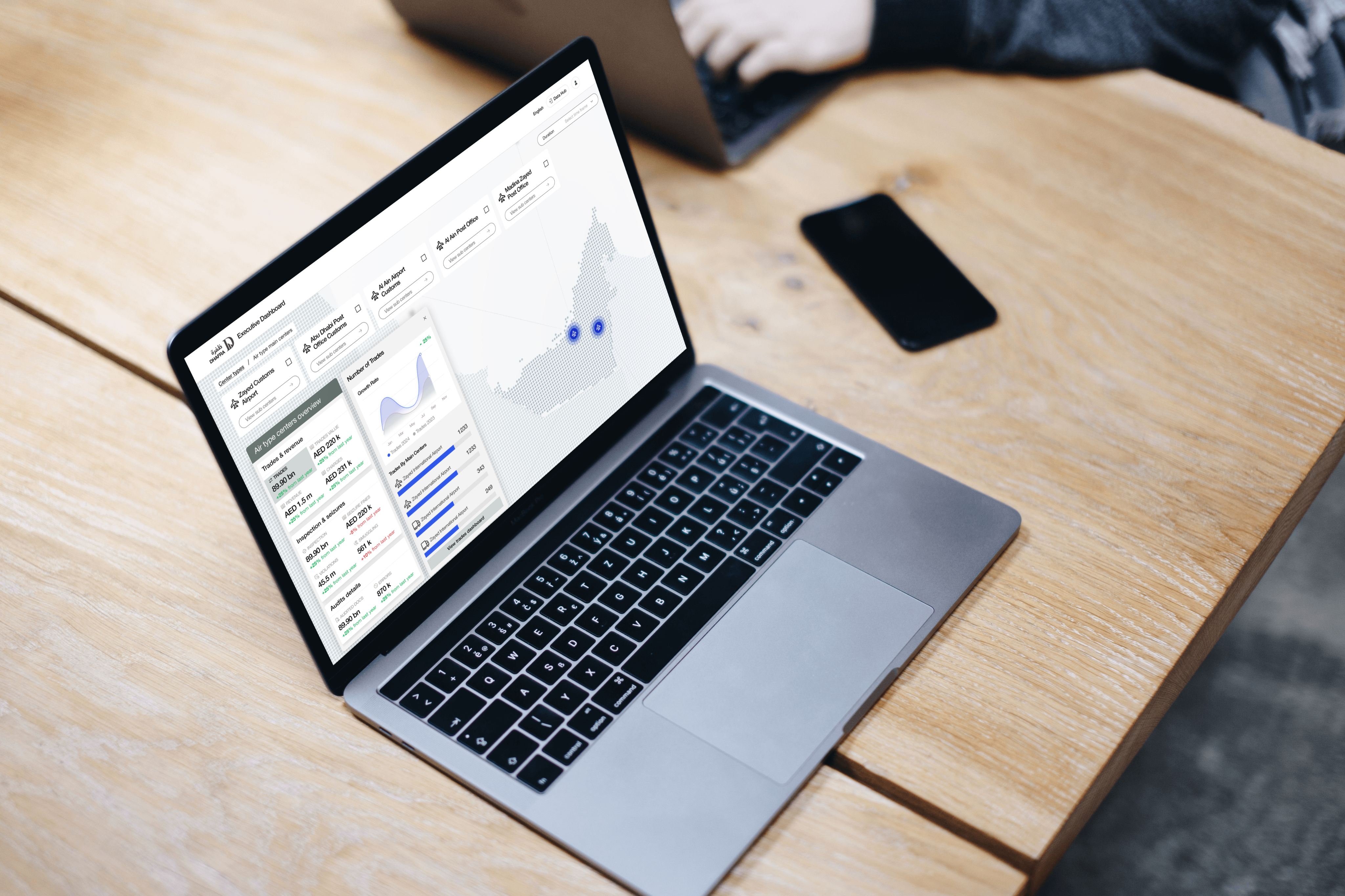
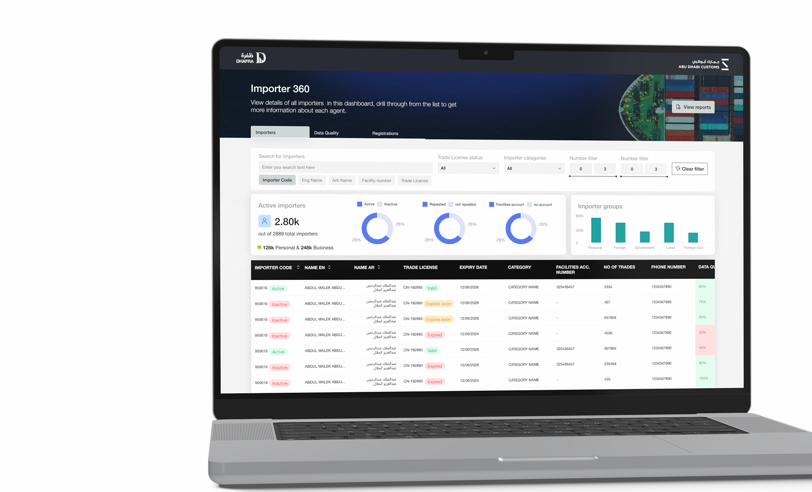
DHAFRA Importer 360 dashboard shown inside a laptop mockup
Project Overview The Importer 360 dashboard shows the core DHAFRA challenge: dense customs data, importer records, data-quality indicators, filters, and reporting actions had to become usable without losing operational detail.

A fragmented data landscape was slowing high-level decisions.

Abu Dhabi Customs had data scattered across multiple sources and domains. This made it challenging to analyse, report, and make effective decisions across the organisation. The lack of a unified search platform and a single point for executive-level analysis made the issue more visible as the number of dashboards and reporting needs grew.

Core Challenge
How might we transform Customs' vast data into meaningful insights tailored to the needs of diverse teams?
Why It Matters
For regulated government operations, the product had to improve decision confidence while still supporting many stakeholder teams with different reporting and search needs.

"The job was to move Abu Dhabi Customs from scattered reporting assets to a more unified, trusted data experience."

A short engagement with wide organisational impact.

I worked as the Senior UI/UX Designer across the DHAFRA experience, moving through research, ideation, wireframing, conceptualisation, high-fidelity design, and iterations. The work covered three connected product areas: Power BI dashboards, an executive dashboard, and the Data Hub.

Design Process

Research · Ideation · Wireframing · Conceptualisation and high-fidelity design · Iterations with stakeholders and implementation teams

This project is strong for the Melbourne market because it shows public-sector-adjacent product design at enterprise scale: analytics, data quality, stakeholder alignment, dashboard UX, and design-system discipline in a regulated environment.

Turning raw BI outputs into decision-ready dashboards.

The Power BI stream focused on a comprehensive view of main KPIs for executive-level analysis. After understanding the client's design language, the cycle moved through visualisation-team input, raw BI priorities, dashboard design principles, and handoff to implementation.

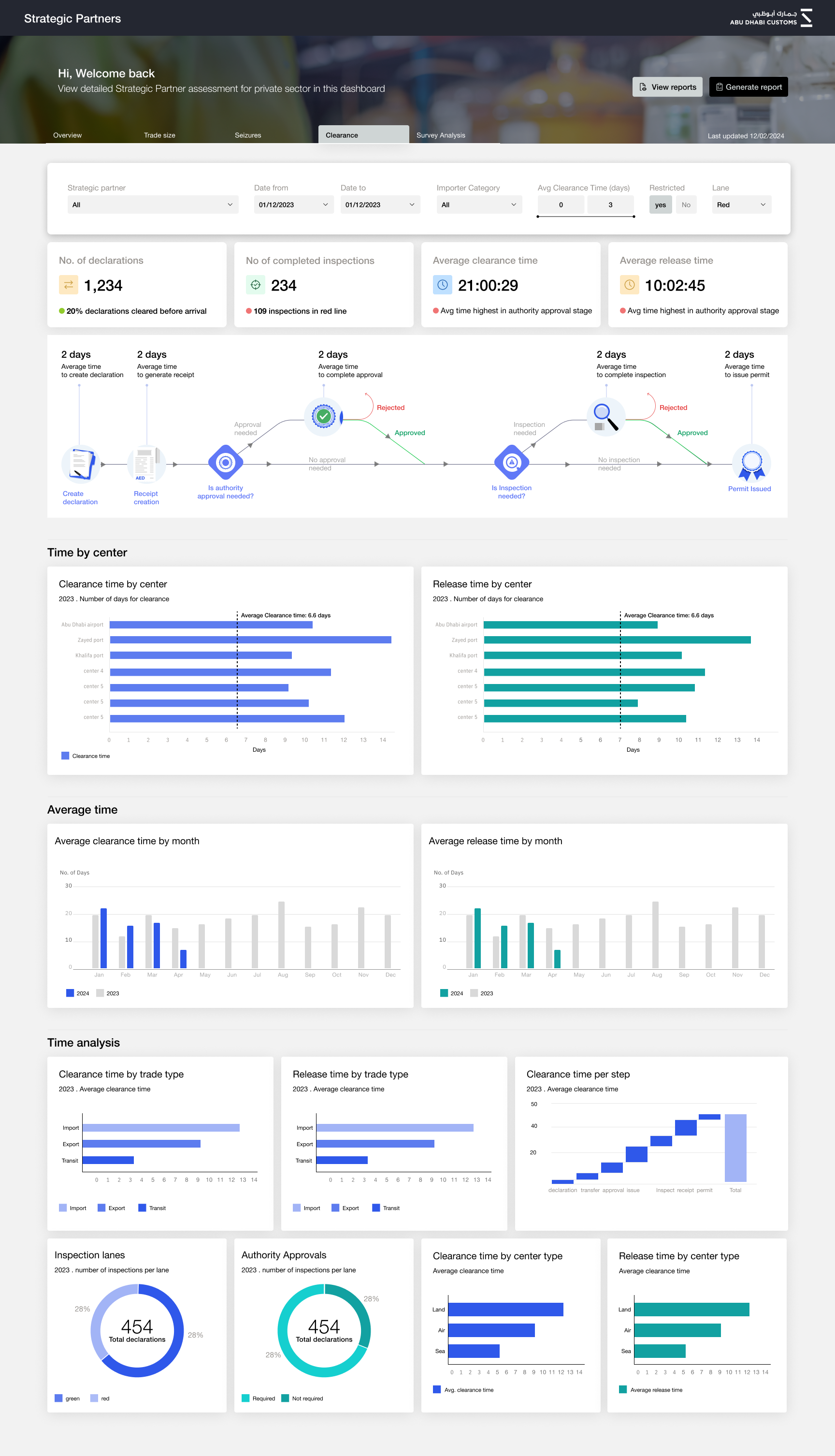
DHAFRA Strategic Partners dashboard with clearance workflow metrics, charts, and time analysis
Power BI Dashboard Stream The Strategic Partners dashboard shows how operational performance, clearance workflows, approval steps, and time analysis were reorganised into a structured Power BI experience for executive and operational review.
What Was Going Wrong
Implemented dashboards deviated from approved designs, visual elements were inconsistent, charts were added ad hoc, and last-minute additions created clutter.
Strategy & Solution
I introduced visual checklists, weekly review, QA with the BI team, and stricter handoff standards so dashboards could be implemented consistently and accurately.

A focused command view for executive insight.

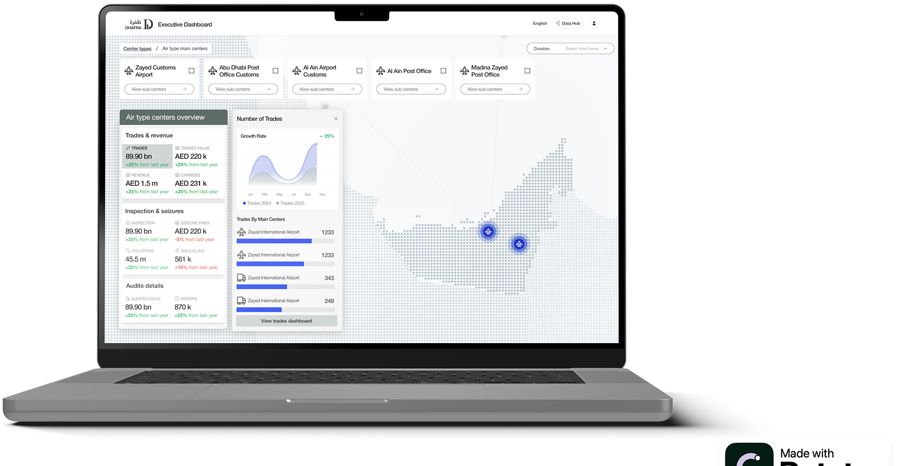
The executive dashboard explored multiple design iterations before moving into an optimised information architecture for enhanced usability. Key patterns included interactive elements, simplified centre filtering, concise analytics, real-time KPI alerts, and drill-down views for bite-sized analysis.

Executive Dashboard The executive dashboard uses map-based context, centre-type filters, KPI summaries, and drill-down cards so senior teams can move from performance signal to detailed analysis without leaving the page.
DHAFRA executive dashboard map interface with KPI panels and air customs centre filters
Map-Based Analysis The still view highlights the final executive interface: centre cards, duration filters, KPI drill-down, and a UAE map that helps leadership analyse customs activity by centre and sub-centre.

A unified search platform for dashboards, reports, and documents.

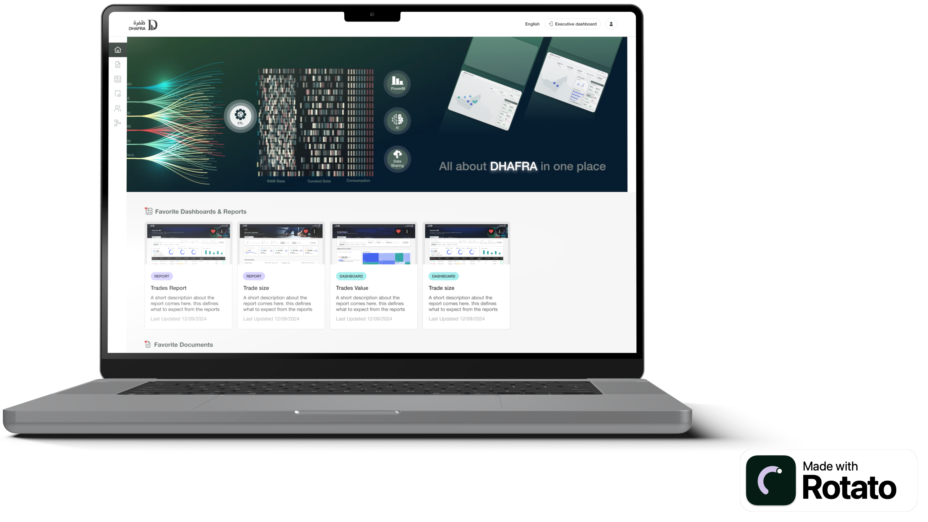
The Data Hub was designed as a single portal for customs users to find dashboards, reports, and documents related to DHAFRA. The experience centred on a personalised home page, effortless document search, and consistent search patterns across content types.

DHAFRA Data Hub home page showing favourite dashboards, reports, and documents
Data Hub The Data Hub home page gives users a tailored entry point into DHAFRA, with favourite dashboards and reports, document access, a persistent side navigation, and a clear bridge into the executive dashboard.
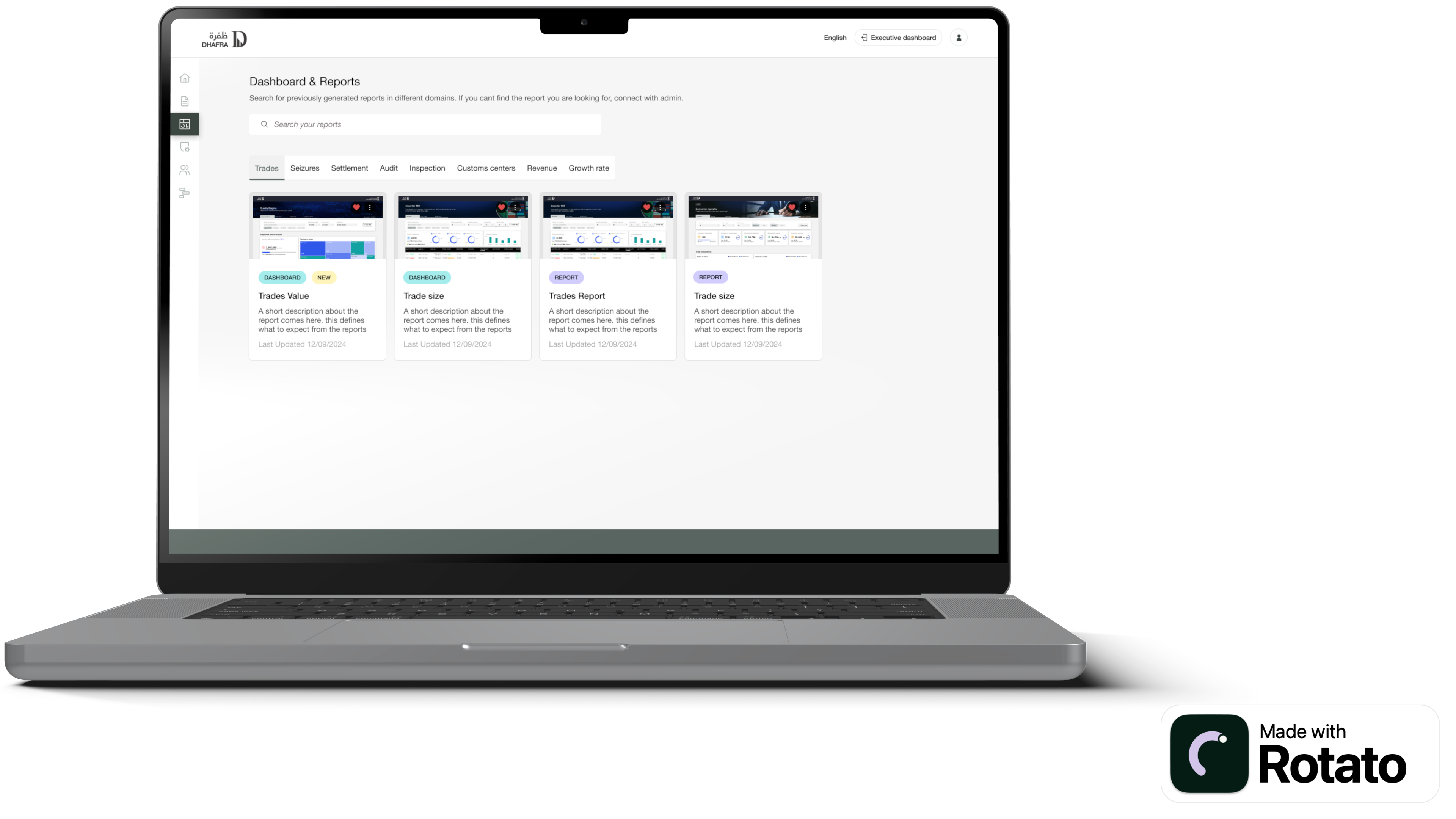
DHAFRA Dashboard and Reports explorer with search, category tabs, and report cards
Dashboard & Reports Explorer The explorer view standardises discovery across dashboards and reports using search, domain tabs, card metadata, labels, favourites, and clear categorisation.

Impact across teams, ports, and reporting workflows.

120+
Dashboards supported through the DHAFRA reporting ecosystem
10+
Stakeholder teams impacted across customs operations
6k-15k
Estimated hours saved per year through improved reporting workflows

The work supported 700+ users across 8 customs ports and contributed to a platform recognised through the Global Customs Innovation Award. A senior leader from Abu Dhabi Customs described the designs as exceptional and highlighted the creativity, attention to detail, and role the work played in the project's success.

For Senior and Lead Product Designer roles, this case shows my ability to operate inside data-heavy enterprise environments: aligning stakeholders, improving implementation quality, designing for analytics, and making complex information usable at scale.

Want to walk through DHAFRA in detail?

Get in touch →
This case study uses selected views derived from the Figma portfolio page. Sensitive government data, implementation details, and unreleased operational information are withheld.
Enterprise Product Design· AI Decision Support· Real Estate· 2025

Al Ghurair Price Pulse -
AI Pricing
Intelligence Platform

Leading research and product design for an AI-powered pricing intelligence tool for a UAE real estate portfolio, helping leasing, revenue, and executive teams compare market signals, generate competitive sets, model pricing scenarios, and turn recommendations into defensible rules.

Client
Al Ghurair Properties × IBM iX
My Role
Lead Product Designer
Team
Led research + 5-person design team
Scope
Discovery, IA, UI, AI workflows
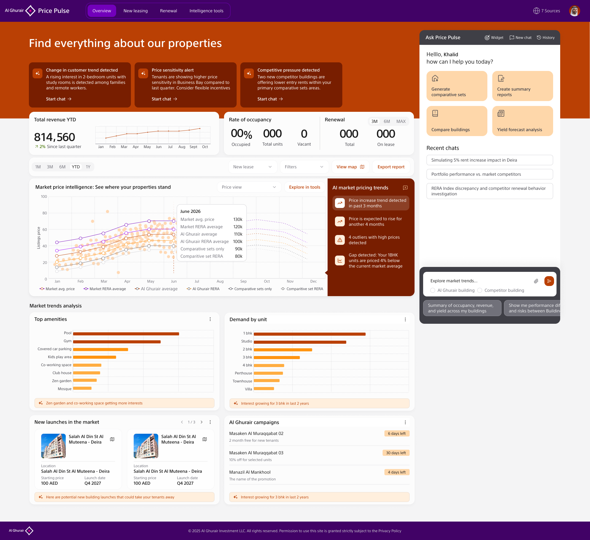
Price Pulse overview dashboard showing revenue, occupancy, AI alerts, market pricing trends, amenities, demand analysis, launches, and campaigns
Product Overview The landing experience brings portfolio performance, AI market alerts, trend analysis, launches, campaigns, and the conversational Price Pulse assistant into one operating view. The goal was to make a pricing decision feel traceable from market signal to recommended action.

High-stakes decisions. Primitive tools.

Al Ghurair manages a large residential real estate portfolio across Dubai, with pricing decisions affecting buildings, unit mixes, campaigns, renewals, and leasing targets. When we started, pricing work relied on disconnected spreadsheets, manual competitor checks, and institutional knowledge held by a small number of people.

The result: scenario planning was slow, inconsistent, and hard to defend. Teams could see fragments of the market, but they could not quickly answer questions like: Which buildings are underpriced against comparable stock? Which units should move first? What happens to yield, contract value, and occupancy if we apply a 4% or 20% rule to selected units?

The Strategic Problem
Pricing decisions crossed leasing, asset management, finance, and leadership. Each group had different evidence, different confidence thresholds, and different definitions of a good outcome.
The Design Opportunity
Create a product that connects market intelligence, competitor evidence, AI recommendations, scenario rules, and projected outcomes so teams can move from signal to decision in one workflow.

"The question wasn't how to visualise pricing data. It was how to make a consequential decision feel safe to make quickly, and defensible afterwards."

Leading strategy and execution for a high-trust user.

I led the research and product design workstream, directing a five-person design team across discovery, product flow definition, screen design, iteration, and stakeholder storytelling. My role was to make the problem frame sharp enough for executives and detailed enough for the design team to execute consistently.

Designing for this user group meant understanding how pricing decisions actually move through the organisation: from market signal, to competitor evidence, to scenario modelling, to rule approval, to implementation. The interface needed to help senior users trust the recommendation while still giving operational teams the controls to act precisely.

Key Constraints

Complex real estate data across locations, buildings, unit types, lease states, RERA benchmarks, competitor listings, occupancy, and revenue · High trust bar for AI recommendations · Multiple user groups with different levels of analytical depth · Need to keep executive views simple without hiding the evidence operations teams required

Scenario mapping workshop artefact showing pricing decision paths and product workflow structure
Research to Flow The scenario mapping work translated stakeholder interviews and pricing logic into a shared product flow. This was the bridge between research findings, AI opportunity areas, and the screens the design team needed to produce.

Understanding the decision before designing the tool.

1
Discovery: Mapping the real pricing workflow

Led interviews and working sessions with stakeholders across leasing, revenue, operations, and leadership to understand how pricing decisions were actually made. We mapped the path from market signal to competitor evidence to scenario modelling to applied rules. The core finding was that the bottleneck was not data availability; it was confidence, traceability, and alignment.

Stakeholder interviewsResearch leadershipDecision mappingWorkflow analysis
2
Strategy: Reframing the product around decision confidence

I reframed the platform from a dashboard into a decision-support product. Instead of exposing every available metric equally, the system needed to guide users through a sequence: detect market movement, compare relevant stock, generate a competitive set, evaluate recommendations, select affected units, and apply rules with visible projections.

Product strategyDecision architectureAI opportunity mapping
3
Architecture: A flow from evidence to action

Structured the product around four connected modules: Overview, Market Price Intelligence, Comparative Analysis, and Scenario Mapping. This gave executives a high-level view while allowing analysts and leasing teams to drill into maps, comp sets, unit tables, filters, and rule creation without leaving the decision context.

Platform IAProduct navigationData hierarchyWorkflow design
4
AI Integration: Recommendations with human control

Designed AI recommendations as prompts for investigation rather than automatic decisions. Price Pulse identifies trends, outliers, gaps against the market, high-demand units, and suggested rate adjustments, but users still choose which buildings or units to include and what rules to apply. Trust came from visible reasoning and human control.

AI recommendation UXExplainabilityScenario modellingHuman oversight
5
Team execution: Turning strategy into a coherent product

I guided the design team through flow definition, visual hierarchy, component patterns, map interactions, table behaviours, empty states, and handoff detail. The team had to design for dense enterprise workflows without making the product feel like another spreadsheet. My focus was keeping every screen tied to the decision journey.

Design team leadershipInteraction designDesign QAStakeholder reviews
Product Flow
Overview → Market intelligence → Comparative sets → Scenario mapping → Rules applied → Forecast projections

From market signal to pricing action.

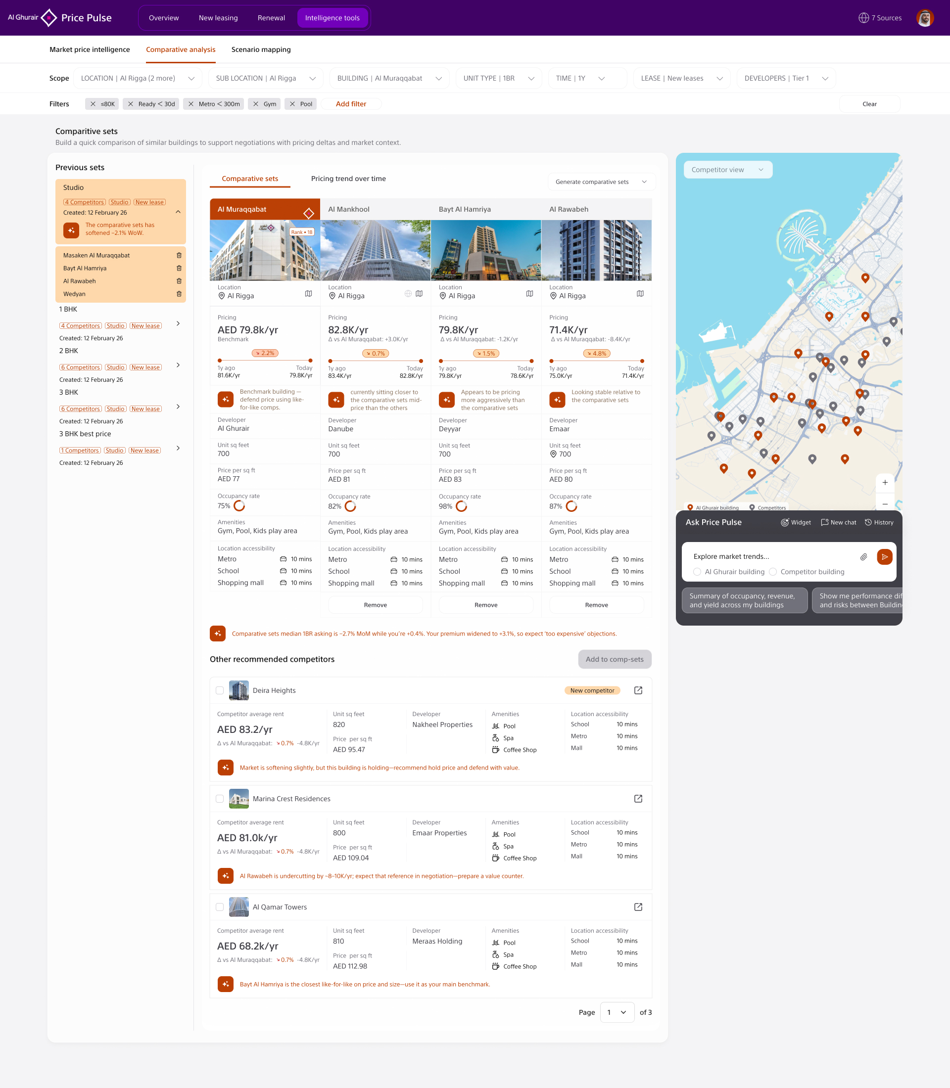
The final product flow was designed around a simple operating rhythm: understand the market, inspect the evidence, generate the right competitive set, model a scenario, and apply pricing rules with projected impact. This helped the product serve both quick executive review and deeper operational analysis.

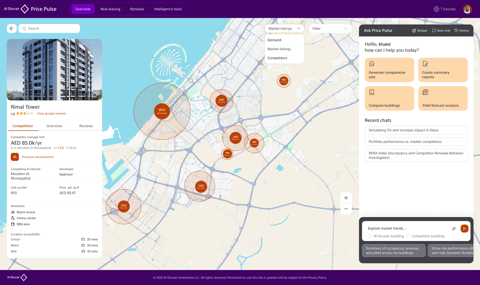
Price Pulse map view with property card, competitor clusters, search, filters, and AI assistant panel
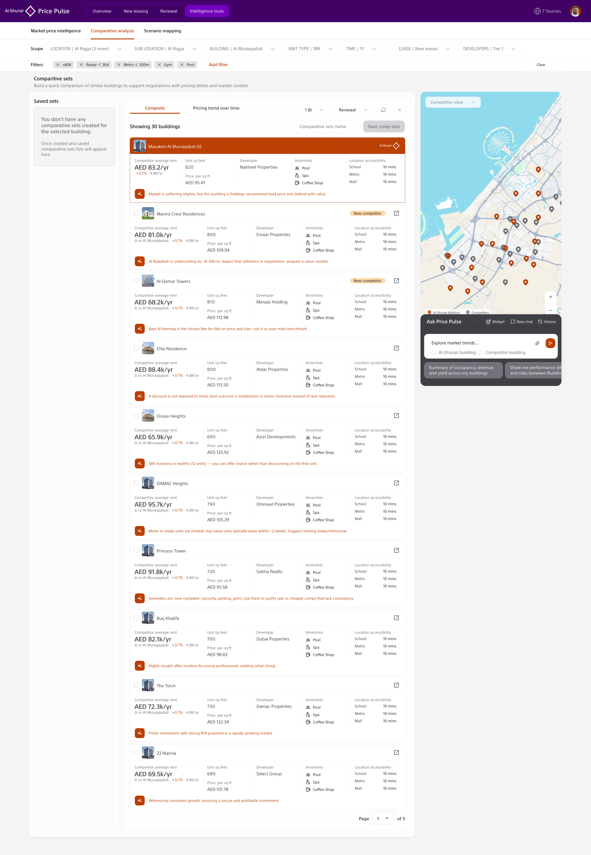
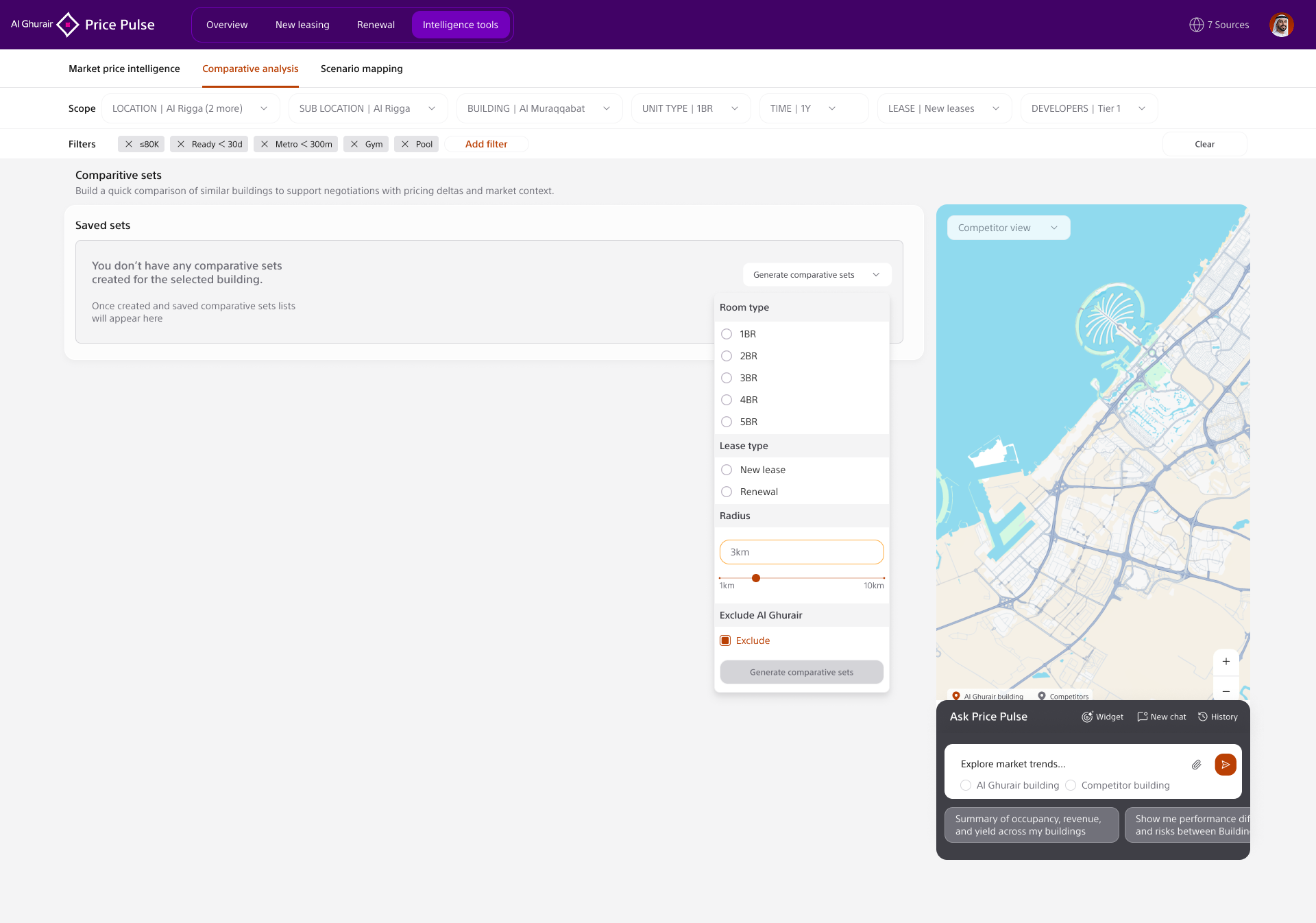
Market Operating View A map-first view shows competitor density, building context, filters, and the AI assistant side by side. This lets users move from a geographic market signal into a specific building or competitor comparison without losing context.
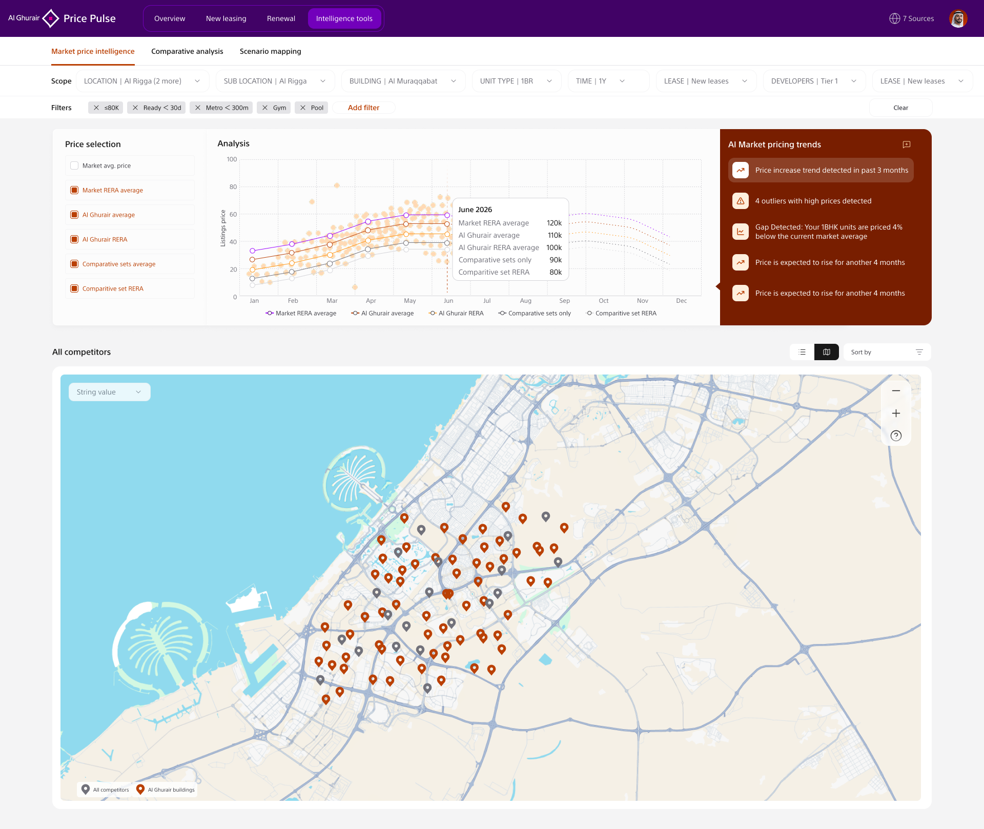
Market price intelligence screen with pricing trend chart, AI market alerts, filters, and competitor map
Market Price Intelligence The intelligence tools view combines pricing trend lines, AI-detected alerts, active filters, and competitor location data. Instead of asking users to reconcile separate charts and maps, the product makes market movement and geographic evidence visible together.
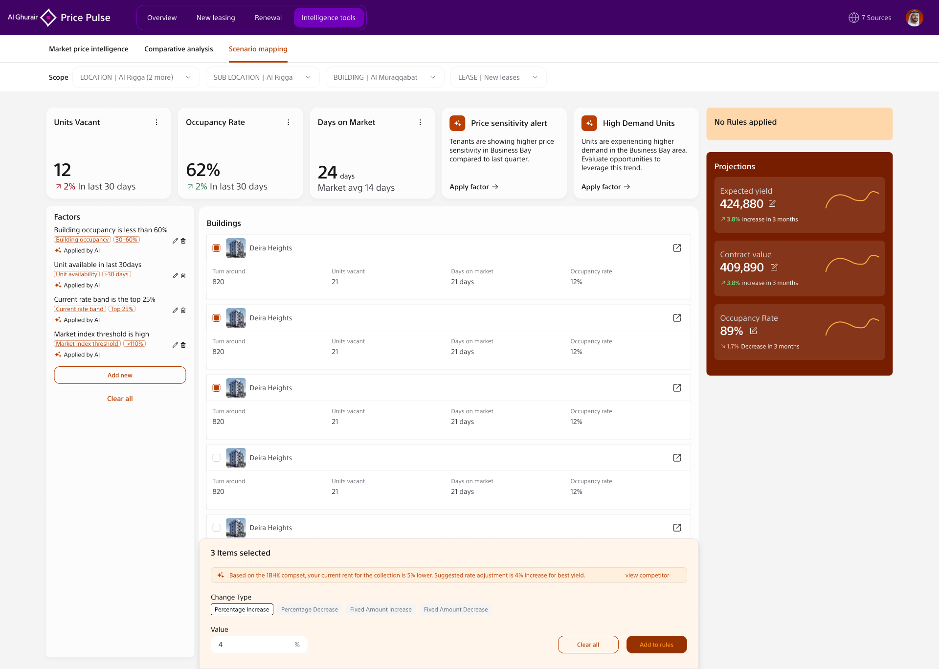
Scenario mapping screen showing selected buildings, AI recommendation, change type controls, and add to rules action
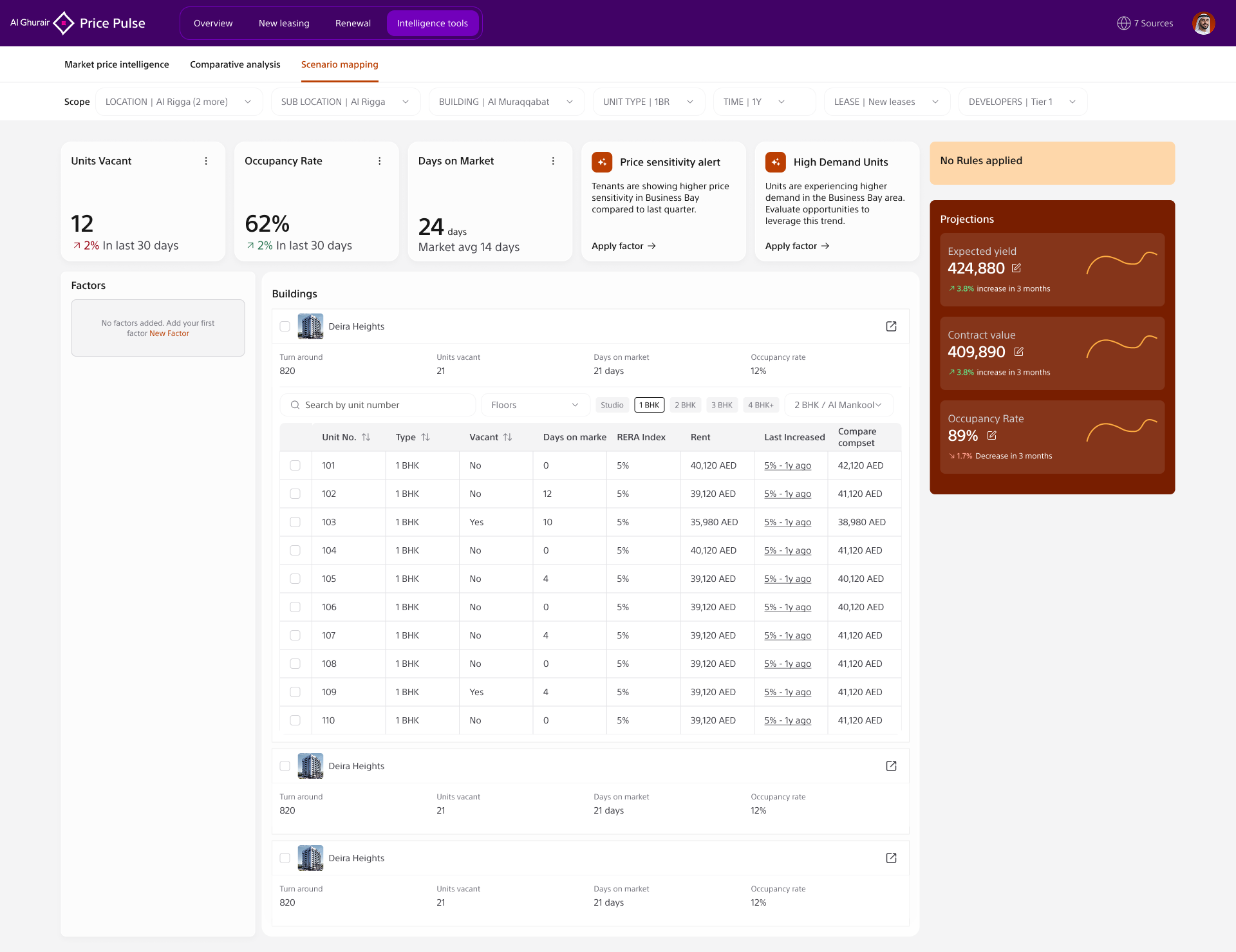
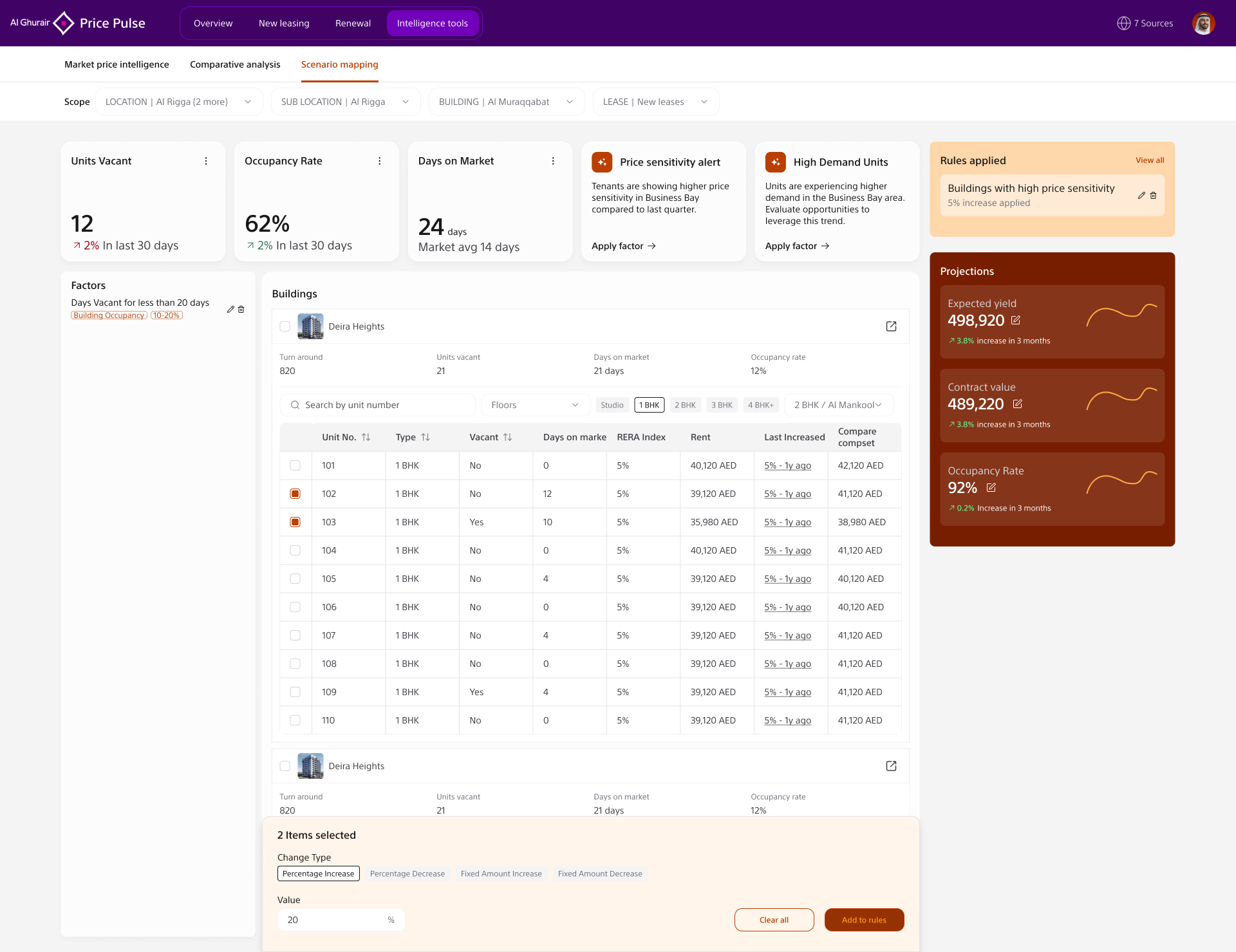
Decision Control The bottom action panel makes the decision explicit: selected items, recommended adjustment, change type, value, and rule action. This was important because AI recommendations needed to feel inspectable and reversible, not hidden inside an automated black box.

What the work made possible.

5
Designers guided across research synthesis, product flows, UI design, and stakeholder-ready storytelling
4
Core modules shaped into one decision journey: overview, intelligence, comparative analysis, and scenario mapping
1
Shared product language for pricing decisions across leasing, revenue, operations, and leadership

The work gave the client team a tangible product vision for pricing intelligence: a way to move from market movements and competitor evidence into applied scenario rules and projections. It also gave internal stakeholders a clearer language for discussing pricing decisions across functions.

For the design team, the project created a reusable pattern for AI-assisted enterprise tools: keep the recommendation visible, keep the evidence nearby, and keep the human action explicit.

Commercial impact metrics and pricing logic are not published publicly. The product flow and selected UI artefacts are shown here for portfolio review.

Honest reflections.

Involve the data team in IA decisions from the start

Some information hierarchy decisions I made based on user research had to be revisited when engineering clarified what data was queryable in real-time versus batched. Earlier technical involvement would have saved two rounds of redesign on the scenario view, particularly the outcome projection layer.

Run executive concept testing in week three, not week eight

I built out a significant amount of the platform architecture before testing with senior users. The "outcomes before methodology" insight, which fundamentally reorganised the IA, only emerged when I put concepts in front of executives. That should happen early enough to shape the architecture, not after it.

Make AI explainability a scope requirement, not a design feature

The explainability layer, showing the reasoning behind AI recommendations, was initially scoped as a nice-to-have. It became foundational to user trust and had to be retrofitted. I'd advocate for it as a non-negotiable requirement from the first project brief, particularly for high-stakes decision-support tools.

Want to walk through the platform design?

Get in touch →
This case study includes selected product screenshots approved for portfolio storytelling. Pricing logic, source data, commercial metrics, and implementation detail are withheld. Full walkthrough available to hiring managers on request.